At a glance
- Three rules: one dominant tone, one shared undertone, intentional contrast
- Red oak and walnut are the most successful warm-tone pairing in residential design
- Solid hardwood desk accessories are the lowest-commitment way to test a new tone before committing to furniture
Mixing wood tones is one of the most common anxieties in interior design, and one of the most unnecessary. The room where every piece of furniture is a different wood and somehow it all coheres — that room was not assembled by accident. It was built with three things: a dominant tone that anchors the space, a consistent undertone that runs through every piece, and contrast that was allowed to happen on purpose rather than managed into oblivion.
The alternative — matching everything to the same species, the same finish, the same grain — produces rooms that feel furnished rather than designed. A showroom floor, not a home. The instinct to match is understandable, but it is the wrong instinct. The rooms that feel genuinely designed are the ones where you can read a decision in every piece, including the decision to put two different species next to each other.
This guide explains the three rules, how they apply at every scale from a full living room to a desk surface, which species combinations work consistently, which do not, and how to use small solid wood objects — pen holders, desk organizers — to test a direction before committing to it in furniture.
Why matching wood does not work the way you think

The standard advice in the 1990s was to match. Buy a bedroom set. Buy a dining set. Let the manufacturer make the decisions. The result was rooms that read as complete out of the box and immediately recognizable as such — the furniture-set aesthetic that makes a room feel temporary, like a hotel room with a different quilt.
What interior designers discovered by studying rooms that actually photographed well was the opposite: variety is not the problem; unintentional variety is. A room with three wood species that share a warm undertone reads as collected. The same three species with clashing undertones — one warm, one cool, one green-gray — reads as chaotic.
The insight that changes how you approach every room: your eye is not tracking species or names. It is tracking undertone. When undertones align, contrast in depth and grain reads as intentional. When undertones clash, even subtle differences feel like mistakes.
The three rules for mixing wood tones successfully
The framework that professional designers apply is not complicated, but it requires deliberate application rather than intuition alone.
Rule 1: Set a dominant tone. One species or finish family should account for 50 to 60 percent of the wood volume in a room — the floor, the primary furniture piece, the largest surface. This is the anchor. Everything else responds to it.
Rule 2: Keep undertones consistent. Warm undertones (red, orange, honey, amber) mix with warm undertones. Cool undertones (gray, ash, blue-gray, green-gray) mix with cool undertones. Crossing the warm-cool line without a bridge piece is where rooms lose coherence. When in doubt: all pieces in a given space should read either warm or cool, never both.
Rule 3: Let contrast be intentional. One dark and two light, or one light against a field of medium — the contrast should be obvious enough that it reads as a decision, not a mistake. A room where all the woods are vaguely similar in depth but slightly different in species is the hardest to make work. Push the contrast further or collapse it; the middle ground is where things look accidental.
Understanding wood undertones before you buy anything

The practical way to read undertone is to hold a wood sample next to a known warm or cool reference. A warm white card (cream, not bright white) next to a species that looks comfortable against it indicates warm undertone. The same card next to an ash or whitewashed piece will create a noticeable tension — that is cool undertone asserting itself.
Warm species include red oak, walnut, cherry, cedar, and most stained mahoganies. Red oak is the most approachable — honey-toned, open grain, it reads warm without being red. Walnut sits deeper: rich brown with purple-red tones in natural light, shifting toward chocolate in artificial light. Both are warm species and mix easily with each other.
Cool species include ash, white oak (often lighter and more neutral than red oak), driftwood finishes, and any piece that has been whitewashed, limed, or gray-stained. These species look best in rooms where the wall colors and textiles also carry cool or gray tones. They do not mix easily with walnut or red oak without a deliberate bridge.
Neutral species — maple, beech, lighter birch — sit in the middle. They do not push hard in either direction. They are useful as bridge pieces in a room that is predominantly warm: a maple accent next to walnut reads as a light break, not a clash.
The species you are working with in solid hardwood desk accessories from our studio — red oak, walnut, and maple — span exactly this range: warm anchor (walnut), warm contrast (red oak), neutral bridge (maple). That is why the combination of these three species, at any scale from a desk to a living room, produces results that consistently read as designed.
Red oak and walnut: why this is the most reliable warm-tone pairing
Red oak and walnut are not similar woods. Red oak is light — honey to amber, sometimes with a pink undertone in direct light, with open pores and a grain that is bold enough to read across a room. Walnut is deep — rich brown, often with subtle purplish tones, tight fine grain that reads quietly from a distance.
What makes them a pair is not similarity but shared undertone family. Both carry warmth. The contrast in depth and grain scale between them is substantial, which means they create visual interest without tension. A walnut piece next to a red oak piece does not look like a mistake; it looks like a decision, because the contrast is too clean to be accidental.
This combination is why the Walnut & Red Oak Pen Holder works as more than a desk accessory. A single object that holds both species side by side is a proof of concept: it shows you what the pairing looks like at small scale before you commit to it at furniture scale. The grain of each wood is visible, the contrast is legible, and the warm undertone runs through both.
The proportional rule with this pairing: let walnut anchor (it reads heavier and more dominant), and let red oak create the lighter contrast. If you invert the proportions — mostly red oak with a walnut accent — the room reads lighter but the pairing still works. What does not work is roughly equal proportions of both, which reads as contested rather than layered.
Spliced and two-tone pieces: the designer move for tight spaces
A room with limited surface area — a desk, a small entryway, a bathroom shelf — cannot easily layer multiple furniture pieces to create tonal depth. The solution that works consistently in tight spaces is to let a single object carry two tones.
Spliced wood pieces — where two distinct species are joined at a center seam — compress a tonal pairing into one object. The Walnut & Maple Spliced Wood Pen Holder does exactly this: one half solid walnut, one half solid maple, seamed at the center. On a maple desk, the walnut half adds depth. On a walnut desk, the maple half creates lightness. On a neutral surface, it introduces both tones at once. The object becomes the room's tonal statement rather than one element in a larger arrangement.
This is a genuinely useful design move because it removes the coordination burden. Instead of finding two pieces that work together, you have one piece that already works as a pairing. The logic applies at the desk scale as it would at the furniture scale — and because the object is small, the risk of the experiment is low.
The five pen holders from our studio, in detail
Each of these is cut from solid hardwood — red oak, walnut, maple, or a combination — and finished to show the natural grain. No veneer, no staining to simulate a species. What you see is what the wood is.

Description
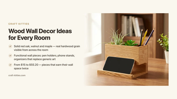
The Red Oak Plant Pod Pen Holder is the most compositionally complete object in the lineup. Solid red oak — warm honey grain, open pores — with a recessed pod that holds a small succulent or air plant. At $55.20 it is the investment piece, but it does something no other pen holder does: it introduces both a natural material and a living element in the same object, which is the fastest way to warm a cold desk surface. On a white or pale desk, red oak this bold reads like a statement. On a walnut or dark surface, it creates the light contrast that the eye expects.

Description
The Walnut & Maple Spliced Wood Pen Holder at $36.00 is the designer pick for rooms already committed to a palette. The walnut half is deep, tight-grained, furniture-quality. The maple half is pale, fine, quieter. The seam between them is a design element rather than a joinery detail: it makes the pairing visible, legible, intentional. On a desk where you are already mixing warm species, this object anchors the concept in a single piece.

Description
The Walnut & Red Oak Pen Holder at $15.99 is the entry point to the most reliable pairing in warm-toned interiors. Solid walnut and red oak, handmade, at a price that makes it a natural first purchase before committing to larger pieces. It functions as both a desk accessory and a sample board: once it is on your desk, you can see how these two species interact in your specific light conditions before scaling the pairing to furniture.

Description
The Wooden Pen Holder & Phone Stand at $35.00 addresses the most common source of desk clutter: phone placement. A phone lying flat takes up disproportionate visual space; vertical in a stand, it disappears into the arrangement. This holder holds pens on one side and the phone upright on the other, in solid wood finished with the grain visible. For a home office desk setup where the desk doubles as a meeting backdrop, reducing clutter on the horizontal plane without adding more horizontal objects is the right move.

Description
The Wooden Pen Holder for Desk — Geometric Pencil Cup at $15.00 is the no-commitment starting point. Solid wood, geometric profile, clean finish. At this price point the commitment is low enough that it becomes a tool for testing: put it on the desk, see how the grain reads against the surface, decide whether this tone is the one you want to anchor the space before buying larger pieces. For rooms still being figured out, a $15 object is the right first move.
Comparison table
| Model | Price | Species | Tonal role | Best for |
|---|---|---|---|---|
| Red Oak Plant Pod | $55.20 | Solid red oak | Warm light anchor | Statement piece, dark or pale desk |
| Walnut & Maple Spliced | $36.00 | Solid walnut + solid maple | Two-tone bridge | Rooms already mixing warm species |
| Walnut & Red Oak | $15.99 | Solid walnut + solid red oak | Classic warm pairing | First piece; testing the walnut-oak pairing |
| Pen Holder & Phone Stand | $35.00 | Solid wood | Warm neutral functional | Desk clutter reduction, meeting backdrop |
| Geometric Pencil Cup | $15.00 | Solid wood | Geometric accent | Low-commitment tone test; first desk object |
Decision matrix — which piece for which situation
| Your situation | The right pick |
|---|---|
| Pale or white desk, want to introduce warmth fast | Red Oak Plant Pod — red oak grain against pale surfaces is immediate |
| Already mixing two warm species, want one object to bridge them | Walnut & Maple Spliced — carries both tones in a single piece |
| Want to test the walnut-red oak pairing before committing to furniture | Walnut & Red Oak — both species visible, at entry price |
| Desk also used as video-call or meeting backdrop, need less clutter | Pen Holder & Phone Stand — reduces horizontal clutter with one object |
| Room still being figured out, lowest-risk first step | Geometric Pencil Cup at $15 — test the tone, commit later |
| Gift for someone with a designed home office | Red Oak Plant Pod — the only desk accessory that includes a live-plant element |
The proportional rule: 60-30-10 applied to wood
Interior designers have long applied the 60-30-10 proportion to color — 60% dominant, 30% secondary, 10% accent. The same logic transfers directly to wood tones, and it is the simplest framework for ensuring that a mixed-tone room reads as layered rather than chaotic.
60% dominant: The floor, the primary piece of furniture, or the largest surface in the space. This is where you commit. In a home office, the desk is often the 60% piece. If the desk is walnut, walnut is the anchor.
30% secondary: The adjacent pieces — a bookcase, a chair frame, a shelf. This is where you introduce the contrast species. On a walnut desk, red oak bookshelves become the secondary tone. They do not compete; they extend.
10% accent: Small objects — pen holders, a decorative bowl, a coaster, a plant pod. This is where solid wood accessories live. At 10% of the visual field, they function as punctuation: they confirm the tonal decision made at 60% without repeating it exactly.
The practical application on a desk: if the desk is pale (maple, beech, painted white), the 30% pieces are mid-tone (oak, ash), and the pen holder — the 10% object — is the darkest piece in the arrangement, walnut. This produces a graded sequence from light surface to dark accent that reads immediately as designed.
Mistakes that produce exactly the mess you are trying to avoid
Buying everything from the same collection. A matched wood set is the designer equivalent of a matchy-matchy outfit. It reads as a unit, not a composition. The three-piece bedroom set in matching walnut veneer feels temporary precisely because the decision was made at the manufacturer, not at the room.
Mixing warm and cool undertones without a bridge. Red oak (warm) next to whitewashed oak (cool) without a neutral bridge between them creates the tension that makes a room feel like two different rooms pushed together. When you are committed to mixing warm and cool, introduce a genuinely neutral species — maple, beech, unfinished birch — as a mediating layer.
Making all the contrasts the same depth. A room with three different species all in the medium-brown range is the hardest to make work. The depths are close enough to look unintentional and different enough to create visual noise. Either push the light species lighter and the dark species darker, or collapse to two that are genuinely close enough to read as one.
Ignoring the floor. The floor is almost always the highest wood volume in a room, which makes it the de facto dominant tone whether you intended it to be or not. All other wood choices in the space should be read against the floor, not in isolation. A walnut desk that photographs beautifully against a white background can look out of place on a pale ash floor if their undertones conflict.
Treating accessories as afterthoughts. Small wood objects — pen holders, trays, coasters — are where you control the 10% accent layer. That layer, applied intentionally, is what gives a room its finish. Applied carelessly, it is where the coherence breaks down. A solid red oak pen holder in a room anchored by walnut confirms the warm-tone decision; a cool-gray desk accessory in the same room undermines it.
FAQ — mixing wood tones in interior design
1 — Can you mix wood tones in interior design? Yes — and the best-looking rooms almost always do. The mistake is not mixing, it is mixing without intention. Set one dominant species as your anchor, keep undertones consistent across pieces (all warm, all cool, or all neutral), and let the contrast between lighter and darker woods read as a deliberate choice rather than a coincidence.
2 — How many wood tones in one room is too many? Three distinct tones is the practical ceiling for most rooms. One dominant (50–60% of the wood volume), one secondary (30%), one accent (10–20%). Beyond three, the room starts competing with itself. The exception is a room built around a material-mixing concept — wabi-sabi, eclectic maximalism — where variety is the point.
3 — Can you mix light and dark wood furniture? Yes, as long as they share an undertone. A pale red oak and a deep walnut read together when both carry warm reddish-brown tones. A light ash and a dark ebony can clash if one reads blue-gray and the other reads red-brown. Shared undertone is what creates the sense that a mix was planned rather than assembled by accident.
4 — Does wood furniture need to match? No. Matched wood sets from a single collection often read more sterile than curated. A room where every piece is the same species and the same finish tends to look furnished rather than designed. Deliberate variation — anchored by a dominant species and unified by undertone — is the design move that makes a room feel collected and personal.
5 — Can you mix walnut and red oak in the same room? Walnut and red oak are one of the most successful pairings in residential design. Red oak is light honey with open, prominent grain; walnut is deep brown with tight, quiet grain. Both carry warm undertones, so they read together. The contrast in depth and grain scale is precisely what makes the combination interesting — not a liability.
6 — Can you mix wood tones and painted furniture? Yes — painted pieces lighten the visual load of a heavily wooded room. The rule is to keep the paint color in the warm or neutral family when your woods are warm. A warm white, soft ivory or warm gray next to walnut reads considered. A blue-tinted white next to red oak looks like a mismatch. The undertone of your painted piece matters as much as the tone of the wood.
7 — What is the easiest wood species to mix with others? Red oak is the most versatile. Its warm honey undertone reads alongside lighter species like maple and ash, and alongside darker ones like walnut. Its open, prominent grain creates natural visual contrast without dominating. It is the default choice when you are building a multi-tone room from scratch and want a species that cooperates with almost everything.
8 — How do wood desk accessories help a mixed-tone desk setup? Small accessories on a desk act as transitions. A walnut pen holder on a maple desk bridges the gap between light and dark. A spliced walnut-and-maple pen holder does the same work in a single object. Because desk accessories are small, low-commitment, and easy to swap, they are the right place to test a new tone before committing to furniture.
Where to go next
The pen holder collection is organized around the same solid hardwood species — red oak, walnut, maple — that run through this guide. Whether you are looking for the entry piece to test a direction at $15 or the statement object that makes the desk its own room, the pieces are there to be combined rather than matched.
For the desk surface specifically, the Red Oak Plant Pod Pen Holder and the Walnut & Maple Spliced Pen Holder are the two ends of the range — the warm-light anchor and the tonal bridge — and they work together on the same surface as easily as they work independently in different rooms.
Our work is also available through Etsy, where 243 reviews from buyers reflect how these pieces actually read on real desks, in real homes, under real light conditions — which is where design choices either hold up or reveal themselves.
What the room that works has in common
It never started with a plan to match. It started with one piece — often the floor, sometimes the desk, occasionally a single inherited chair — and every subsequent object was chosen in relation to that first piece rather than in relation to the idea of a room.
The method this guide describes is a way of making that process systematic. Set your anchor. Check your undertones. Let the contrast be obvious enough to read as a decision. Apply the 60-30-10 proportion. Use small solid wood objects at the 10% layer to confirm the direction before committing furniture budgets to it.
The Walnut & Red Oak Pen Holder at $15.99 is the right first object for that last step. It holds the two species that designers reach for first in a warm-toned room, in your light, on your surface, for less than the cost of a design book that tells you to do the same thing.