At a glance
- Warm earth tones are built from real materials — soil, bark, clay, grain — not just a color range
- Walnut anchors pale rooms; red oak bridges terracotta palettes; beech recedes where warmth is already present
- A solid hardwood valet tray at the entryway is both the organizational anchor and the first earth-tone material statement
The phrase "warm earth tones" has become vague from overuse. It shows up on mood boards describing everything from raw cement to paper-bag paint to fake rattan baskets. Its reach is wide enough that it has lost its precision — which is why so many rooms assembled around it feel pleasant in photographs and oddly unconvincing in person. The colors are right. The materials are not.
That gap is the actual problem. A room built from warm-toned synthetics — acrylic pile approximating jute, MDF with a walnut-print film, clay-colored resin described as "ceramic-inspired" — shares the color range of an earth-tone palette but none of its character. The original palette worked because it was the materials: soil, stone, bark, grain. The warmth was not applied to the surface; it was inside it.
Reconstructing that quality in a contemporary home does not require a renovation. It requires a few objects that are genuinely what they appear to be, placed with enough intention that the surrounding context reads as a system rather than an accumulation. This guide covers the palette mechanics, the species choices, the texture logic, and the specific pieces — all in solid hardwood — that do the most work for the least intervention.
What makes a color an earth tone
The definition is mechanical, not aesthetic. Earth tones are the colors present in unprocessed natural materials: soil in its range from pale sand to dark umber, bark from birch-white through chestnut to near-black walnut, clay from buff through terracotta to brick, dried botanicals from straw to camel, stone from warm limestone to slate. What they share structurally is a yellow or red undertone. None lean cool or blue.
This distinction matters because color reads differently against different light temperatures. A color that looks warm on a paint chip under store lighting can read lavender against morning north light or brown under incandescent. The reliable test is to hold the swatch against a piece of raw or natural-finish solid walnut or red oak. If the two feel like they belong in the same outdoor landscape — the same canyon, the same forest floor — it is a true earth tone. If the swatch reads cooler or greyer than the wood, it belongs in a different palette.
The family is broader than most people initially work with: terracotta, warm sand, camel, rust, ochre, raw umber, dusty olive, warm taupe, dried-clay buff, and the full spectrum of natural wood. Cream and ivory belong when their undertone is warm. Stark white does not. Cool grey does not. Forest green and navy can sit alongside earth tones as contrast, but they are not members.
The palette system: 60-30-10 applied to warm rooms

The 60-30-10 distribution is useful not because it is a rule but because it explains why so many earth-tone rooms fail. The failure mode is almost always too much in the ten-percent tier: too many terracotta objects, too many rust cushions, too many dark accents — and not enough pale anchor to give them room to read. When the accent becomes the dominant, the palette loses its hierarchy and everything reads at the same visual weight.
The sixty percent is the pale neutral that reflects light: warm cream on the walls, a linen-upholstered sofa, a light-sand area rug. Its job is to prevent the room from compressing. In a warm palette this tone should have a yellow or cream undertone — not cool white, not grey-white. The difference between the right pale and the wrong pale is the difference between a room that reads as an earth-tone interior and one that reads as a collection of warm objects on a cool background.
The thirty percent is where most of the tactile interest lives: a natural jute rug, warm taupe curtains, a linen throw, a camel-tone chair. These are the surfaces that define mood and comfort before any small object enters the room. They also carry most of the texture work. A thirty-percent tier built from genuinely natural materials — real linen that creases, a rug with perceptible weave depth — gives the room dimension regardless of what sits on the shelves.
The ten percent is the accent tier: solid wood, ceramics, metallic objects, cushions. This is where real hardwood does its most legible work. A walnut tray on a pale linen surface reads immediately as the warmest, most material-honest object in the frame — not because it is large, but because its grain is visually complex in a way that painted or printed surfaces are not. It earns its ten percent.
Solid wood vs wood-look: why the distinction is load-bearing

The difference between solid hardwood and a wood-look surface is not visible in a hero product photograph taken in even overhead light. It becomes visible within weeks of daily use. A printed wood film over particleboard or MDF cannot develop a surface patina, chips at exposed edges from repeated contact, and reads completely flat under raking light — because it has no physical grain depth to catch the micro-shadows that make natural wood glow. Solid red oak, walnut, or beech catches light differently at every angle, because the actual cellular structure of the wood creates micro-relief across the surface. That difference is what gives a room material honesty that holds in all light conditions, all seasons.
In an earth-tone home, this distinction is especially load-bearing because the whole palette depends on real materials reading as real. A printed walnut-film tray in an otherwise natural-material room introduces a visual note of inauthenticity that erodes the confidence of everything around it. Conversely, a single piece of genuine solid hardwood — even a small one — validates the whole composition, because it is visually and tactilely consistent with the linen, jute, and ceramic that surround it.
The practical implication: real hardwood belongs in the objects most handled daily, because those are the ones that reveal material quality fastest. The tray where keys land. The desk organizer touched a dozen times a day. These are the right places for solid wood.
Walnut, red oak, and beech: which species for which palette
Walnut is the deepest earth-tone wood in common use. Its fine, tight grain in deep brown gives maximum contrast against pale walls, cream linen, and light sand surfaces — which is precisely why it is the most requested species for rooms where the dominant tones are already pale. Against a cream wall, a solid walnut tray reads as the deliberate punctuation that makes the palette feel complete. Its undertone is warm red-brown, which flatters both rust and brushed brass in equal measure.
Red oak sits in the honey-amber range: a bold, clearly readable grain with a warmth that straddles the terracotta and camel end of the palette. It is the most forgiving species in a room whose palette is still forming — warm enough to work with most earth-tone secondaries, light enough not to compete with darker accent colors. In rooms built around cream and pale sand, red oak provides the warmth the palette needs without the contrast depth of walnut.
Beech is the palest of the three. Fine-grained and consistent, almost ivory in natural light, it is the species for rooms that are already rich in mid-value earth tones and need a wood that recedes rather than competes. In an entryway with terracotta tile, a camel runner, and a warm-toned console, a beech tray grounds the composition without adding another competing mid-value. It is also the most dimensionally stable of the three, which is relevant for any surface with fluctuating humidity.
The contrast rule applies universally: the paler the room's dominant tone, the darker the species to choose. The warmer and more saturated the room, the paler the species. A mid-tone wood against a mid-tone background produces the one outcome the palette cannot sustain — an undifferentiated mass of warmth with no hierarchy.
The entryway as material statement
The entryway is the room most commonly overlooked in interior design planning. It is also the room that sets every other room's tone. A palette that coheres from the door onward reads as a system; one that starts with a different vocabulary at the entry creates a visual discontinuity that the subsequent rooms cannot fully undo.
The entryway's functional demands are specific: keys, wallet, phone, and bag need a fixed landing spot within arm's reach of the door. Without a designated surface, these objects disperse across every horizontal plane in the room, and the entryway becomes the room that accumulates rather than the room that organizes. A solid hardwood tray with a raised edge sets a physical boundary that solves this mechanically: everything inside is deliberate, everything outside is clutter.
In an earth-tone entryway, the tray does a second job simultaneously. Placed on a pale console against a cream wall, a walnut or red oak tray becomes the ten-percent accent — the one object that announces the material palette at eye height the moment you walk in. It does not need to be large. It needs to be real.

Description
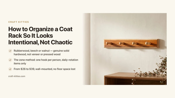
The Hardwood Valet Tray & Key Rack at $29.99 is the entry point to the valet tray collection and the single piece that most efficiently solves the entryway problem. The tray surface catches daily-carry; the rack holds the actual keys at a fixed point above. The hardwood construction — real grain, solid through its depth — gives the piece the weight and surface quality to function as a design object rather than a utilitarian container. It is the right first upgrade for an entryway that currently has no designated surface.
The desk: earth-tone material at arm's reach for eight hours a day
The desk is the hardest room in a home to make feel warm. Screens, cables, and devices occupy most of the visual field in cool silver, matte black, and white. The default atmosphere is utilitarian. Introducing warm earth-tone materials at desk height requires working against that default without making the setup feel artificially styled.
Real solid wood is the most efficient counter to the screen stack. One correctly chosen hardwood tray or organizer on a neutral desk reads immediately as the warmest, most material-honest object in the frame. Not because it is prominent — it is typically smaller than any screen — but because grain is visually complex in a way that polished aluminum or matte plastic is not. The eye goes to it. That visual attention is what shifts the desk from functional to considered.

Description
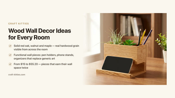
The Hardwood Valet Tray Desk Organizer at $47.20 is available in maple, beech, and walnut — three positions within the earth-tone spectrum, each suited to a different surrounding context. Beech for warm-toned or mid-value desks where the wood should recede. Walnut for pale or white-dominant setups where the wood should anchor. Maple for the middle range, where a warm gold tone bridges without demanding attention.

Description
The Solid Wood Valet Tray Desk Organizer at $55.20 is the right choice for desks where material quality is examined at close range every day. The deeper volume accommodates larger wallets, two devices, or a watch alongside standard daily-carry without objects cresting the tray edges. At close range, solid wood finished with care shows a surface character — the micro-relief of real grain, the slight warmth of the finish — that holds up to the kind of daily attention a desk gets.
Description
Description
Layering textures in an earth-tone room
Texture is what distinguishes a warm room from a warm mood board. The difference is mechanical: texture creates micro-shadows at every surface, which means the apparent color of any material shifts as light moves through the day. A walnut tray in morning light reads honey-brown; in afternoon shadow it reads almost espresso. That shift is what makes a material feel alive rather than decorative.
The working set for an earth-tone room is three to five distinct surface types: smooth solid wood, matte linen or raw cotton, natural fiber (jute, rattan, seagrass), and one partially reflective surface (ceramic glaze, brushed metal, glass). A fifth — leather, stone, velvet — adds depth without tipping into excess. Fewer than three surfaces and the room feels monolithic; more than five and the eye has no rest point.
The texture failure mode worth naming explicitly: the room where every surface is rough and natural simultaneously. Jute rug, rattan chair, woven-cotton wall hanging, unfinished wood tray, raw linen curtains — each beautiful individually, collectively fatiguing because they all occupy the same textural register. The fix is always one smooth anchor. On a desk, a solid hardwood tray with a sealed finish provides the smooth horizontal surface that lets the rough ceramic mug and linen wrist rest read as intentional. Without the smooth counterpoint, everything reads at the same visual weight and the composition collapses.
Placing the pieces: the sequence that builds a coherent room
The rooms that read as genuinely earth-tone are built in sequence, not all at once. Sequence lets each decision confirm before the next one is made — and it is far easier to diagnose what is not working when you have introduced one element at a time rather than reconfigured the entire room in a weekend.
First: identify the dominant surface undertone. In most rooms, that is the wall color or the floor. If you are working with an existing dominant surface, its undertone defines the palette constraint. Warm beige wall: wide latitude for mid-value accents. Cool grey wall: earth-tone objects will work but read more subdued. Know this before any other decision.
Second: settle the thirty-percent tier. A jute rug, a linen throw, warm taupe curtains. This tier has more influence on mood than any small object. A natural jute rug transforms a neutral room faster than a dozen terracotta accents. Get one large textile right before moving to counter-height objects.
Third: introduce one real wood piece at counter height. This is the step that shifts a room from "neutral and comfortable" to "intentional earth-tone." It works because grain is visually complex at eye level in a way that painted surfaces are not. The tray in the entryway, the organizer on the desk — these are the right placements because counter height is the natural sightline of a standing person.
Fourth: complete with ceramics or stone at the accent tier. Terracotta pots, a stone coaster, a ceramic dish. Small, adjustable, inexpensive to experiment with. The wood is the anchoring decision; the ceramics are the fine-tuning. If a terracotta vessel reads too orange against the wood you chose, swap it for a cream ceramic. The palette is right when no individual object demands attention and the whole reads as a temperature.
Comparison table
| Model | Price | Wood species | Best placement | Earth-tone role |
|---|---|---|---|---|
| Hardwood Valet Tray & Key Rack | $29.99 | Solid hardwood | Entryway console | First material anchor, ten-percent accent |
| Hardwood Valet Tray Desk Organizer | $47.20 | Maple, beech or walnut | Desk or side table | Warm grain against screen stack |
| Solid Wood Valet Tray Desk Organizer | $55.20 | Maple, beech or walnut | Desk or nightstand | Premium close-range material quality |
Decision matrix — which piece for which room situation
| Your situation | The right pick |
|---|---|
| Entryway with no designated drop zone — first real wood object in the house | Hardwood Valet Tray & Key Rack ($29.99) |
| Pale walls (cream, linen, sand) — need a dark wood anchor | Solid Wood Desk Organizer in walnut ($55.20) |
| Already warm room (terracotta, camel, rust) — need wood that recedes | Hardwood Desk Organizer in beech ($47.20) |
| Standard desk carry: phone, wallet, earbuds, keys | Hardwood Desk Organizer ($47.20) — standard depth, nothing wasted |
| Heavier desk carry: two devices, larger wallet, watch | Solid Wood Desk Organizer ($55.20) — deeper volume, nothing cresting |
| Gift for someone building an earth-tone home | Hardwood Valet Tray & Key Rack ($29.99) — used daily, safe across any warm-palette entryway |
Mistakes that undermine earth-tone rooms
Choosing color from a screen. Warm earth tones depend on how they behave in natural light, which monitors cannot replicate. Terracotta that looks perfectly warm in a product photo can read orange or muddy in a north-facing room under daylight. Order paint samples, or introduce one small earth-tone object first and observe it across different times of day before committing to paint or large textiles.
Adding too many accent colors. Earth tones cohere when the palette is narrow — one pale anchor, one mid-value, one deep note. The temptation to add rust and ochre and brick simultaneously is understandable; each is beautiful alone. Together they produce a room where no color has priority and the warmth reads as noise rather than atmosphere. Three tones, then stop.
Matching instead of coordinating. When the walnut tray matches the walnut floor which matches the walnut shelf exactly, the room reads as a showroom sample. Coordinating means the tray's deep brown is in conversation with the warm sand of the rug and the terracotta of the adjacent pot — same palette temperature, different specialementsion. Coordination produces depth; matching produces flatness.
Using wood-look finishes at the most-handled surfaces. A wood-effect vinyl in a utility area is a reasonable practical decision. A printed-film tray handled multiple times daily is not: the edges chip, the print fades, and the material announces itself as synthetic within months. Real hardwood at the most-touched surfaces is not a luxury upgrade — it is the correct material for the level of use.
FAQ — warm earth tones home decor
1 — What colors count as warm earth tones? Warm earth tones draw from the palette of soil, bark, clay, and dried botanicals: terracotta, camel, rust, ochre, raw umber, warm sand, and the full spectrum of natural wood from pale maple to deep walnut. Their shared trait is a yellow or red undertone — none lean cool or blue. Cream and ivory belong; stark white and greige do not.
2 — Which wood species work best in an earth-tone interior? Walnut, red oak, and beech are the three that anchor these palettes most reliably. Walnut's deep brown and tight grain give maximum contrast against pale walls. Red oak's honey tone bridges terracotta and camel palettes naturally. Beech is the palest — the species that recedes when the room is already warm and layered.
3 — How do you layer textures without the room feeling heavy? One rough surface per visual layer (jute rug, linen throw, rattan pendant, raw clay vessel), balanced in each case by a smooth counterpoint nearby — polished wood, ceramic, glass, or brushed metal. The contrast between rough and smooth is what makes each element readable. All-rough surfaces simultaneously produce fatigue rather than warmth.
4 — Can earth tones work in a small room? Yes, with one condition: one pale dominant anchor that reflects light. Warm-toned accents over a pale cream wall or linen sofa create richness without compressing the space. In a small entryway, a solid walnut tray on a white console does more for the palette than painting the walls terracotta — and keeps the room open.
5 — What is the difference between earth tones and neutrals? Neutrals include cool greys and blue-whites that read almost tone-free. Earth tones are neutrals with a decided warm bias. The practical test: hold a swatch next to raw walnut. If both belong on the same canyon floor, it is an earth tone. If the swatch reads greyer or cooler than the wood, it is a neutral.
6 — What is a valet tray and why does it belong in an earth-tone entryway? A valet tray is a flat, lipped organizer for daily-carry — keys, wallet, watch, phone. In an earth-tone entryway it solves both the functional problem (one fixed landing spot) and the material problem: real walnut or beech grain reads immediately as a deliberate object, the smooth hardwood surface provides textural contrast to surrounding rough materials, and its warmth reinforces the palette.
7 — How do you mix metals in an earth-tone room without it looking accidental? Pick one warm metal family — brushed brass or antique bronze — and let it appear at three or more points: a hook on the key rack, a lamp base, a cabinet pull. One warm metal accent reads accidental; three reads intentional. Avoid mixing warm and cool metals unless one clearly dominates. Earth-tone palettes share the same yellow-red temperature as warm metals and clash with chrome or polished steel.
8 — Are solid hardwood trays hard to maintain? No. A sealed hardwood tray needs a dry or barely damp cloth and no abrasive cleaners. The finish does the protective work. After years of use, a light coat of beeswax restores depth in under ten minutes. Unlike veneered pieces, solid wood can be lightly sanded and re-oiled if scratched, which means it improves with age rather than degrading.
Where to go next
A warm earth-tone home is built one real-material object at a time. The valet tray collection gathers the counter-height pieces — entryway trays, desk organizers, key racks — in the solid hardwood species that anchor these palettes most efficiently. The Hardwood Valet Tray & Key Rack starts the palette at $29.99 and is the right first upgrade for an entryway that currently has no designated surface. The Solid Wood Valet Tray Desk Organizer extends it to the workspace at $55.20, in walnut for pale rooms and beech for warm-saturated ones. Customers who have added these pieces to their homes describe the same thing consistently — that one object in real grain shifted the reading of the whole room. Which is, in the end, what earth-tone design at its best has always been: one material, honestly chosen, that makes everything around it more coherent. If you discovered this collection through Etsy, where our studio has over 243 reviews, you will find the same material honesty across every piece in the range.